How to Create a Landing Page That Actually Converts
Published by the Adaptix Team · June 2026
Most landing pages don’t fail because of bad design. They fail because no one thought clearly about what the visitor is supposed to do next.
A landing page has one job: move a specific person toward a specific action. That’s it. No navigation menus pulling attention sideways. No three different offers competing for a click. Just one clear message, one clear audience, one clear next step.
This guide walks through exactly how to build a landing page that does that job — from structure and copy to the technical details that separate pages that convert from pages that just sit there.
What Makes a Landing Page Different From a Regular Web Page
A regular web page is designed for exploration. A landing page is designed for decision.
Standard website pages have menus, footers, related links, and multiple CTAs. All of that is intentional — you want visitors to browse. On a landing page, those same elements become friction. Every extra click path you offer is another way for a prospect to leave without converting.
High-converting landing pages typically share a few structural traits:
- A single, clearly defined goal (one offer, one action)
- Minimal or no navigation
- Copy and design that speak directly to a specific audience
- A form or CTA that is impossible to miss
- Social proof that addresses the most common objections
That doesn’t mean every landing page looks the same — format varies based on the offer, the traffic source, and the audience. But the principle holds across all of them.
The Anatomy of a High-Converting Landing Page
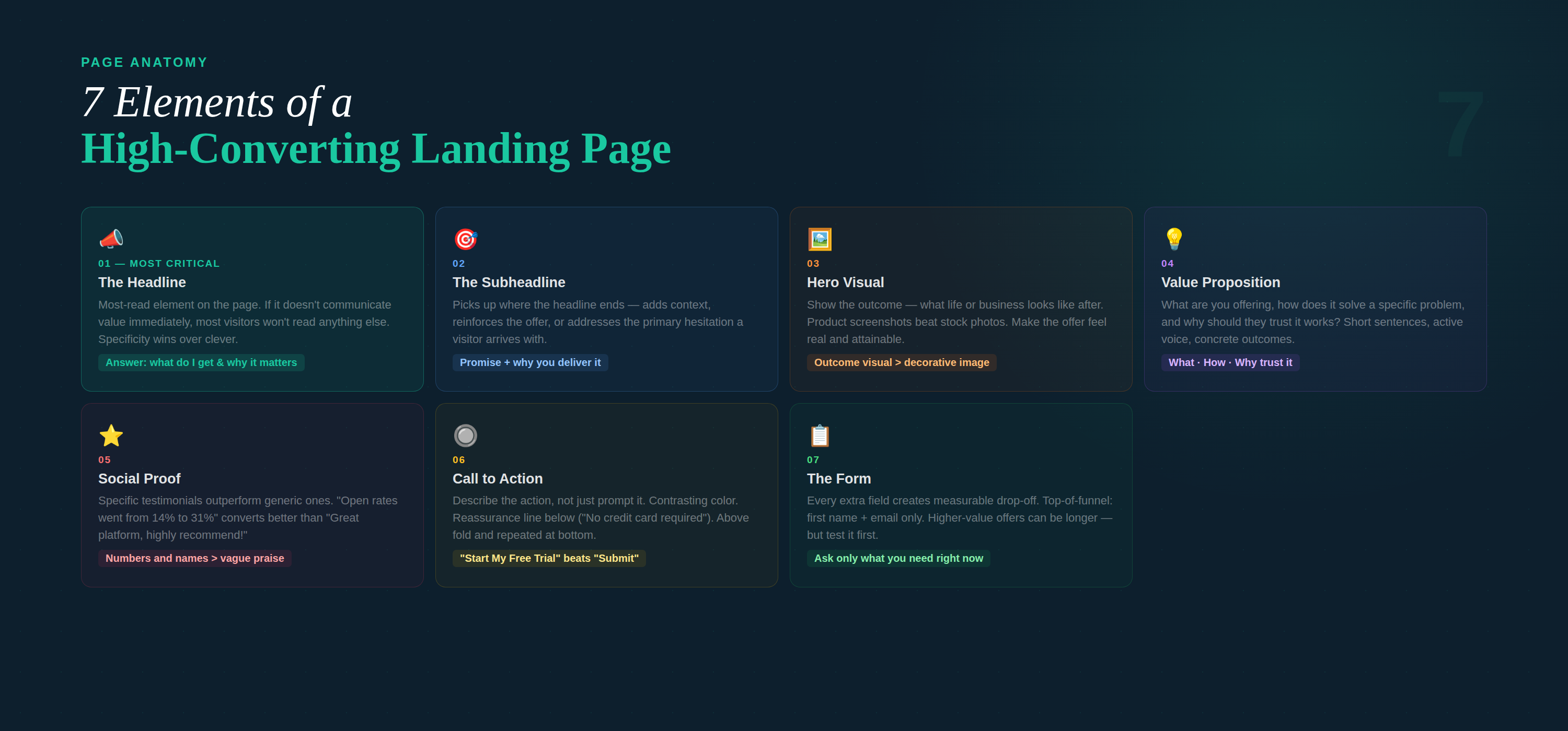
Break any successful landing page into its components and you’ll find the same core elements. Here’s what each one needs to do and why it matters.
- The Headline
Your headline is the most-read element on the page. If it doesn’t immediately communicate value, most visitors won’t read anything else.
A strong headline answers one question fast: what do I get, and why does it matter to me? It doesn’t have to be clever. It has to be clear.
Example: A local HVAC company running a seasonal tune-up promotion used “Get Your AC Ready Before Summer Hits — Schedule a $49 Tune-Up Today.” Specific, timely, and exactly what a homeowner searching in April needs to see.
Avoid vague benefit statements like “Take Your Business to the Next Level” — they say nothing and convert poorly. Specificity wins.
- The Subheadline
Think of the subheadline as the headline’s closer. It picks up where the headline leaves off — adding context, reinforcing the offer, or addressing the primary hesitation a visitor might have.
If the headline makes the promise, the subheadline explains why you’re the right one to deliver it.
- Hero Image or Visual
Visuals should support the message, not decorate the page. The most effective approach is usually showing the outcome — what the person’s life or business looks like after using your product or service.
For service businesses, a clean photo of the team or workspace builds trust. For software, a product screenshot showing a key feature beats any stock photo. The goal is to make the offer feel real and attainable.
- The Offer and Value Proposition
This is the core of the page — what you’re actually offering and why it’s worth the visitor’s time, money, or information. It needs to answer three questions quickly:
- What am I getting?
- How does this solve my specific problem?
- Why should I trust that this works?
Keep the copy tight. Paragraphs that run long on landing pages get skipped. Use short sentences, active voice, and concrete outcomes over vague claims.
- Social Proof
Testimonials, reviews, case study results, or logos from recognized clients all do the same thing: they tell the visitor that someone like them already tried this and it worked.
The most effective social proof is specific. “Our email open rates went from 14% to 31% in six weeks” converts better than “Great platform, highly recommend!” When you have real numbers, use them.
Example: A boutique fitness studio offering a free first class used three short testimonials on their landing page — each from a different type of member (busy parent, recent retiree, young professional). Every visitor could see someone who looked like them. Conversions increased 40% compared to their previous page.
- The Call to Action (CTA)
The CTA is where everything else leads. A weak CTA undercuts a strong page. A few principles that consistently improve CTA performance:
- Make the button text describe the action, not just prompt it. “Start My Free Trial” outperforms “Submit.”
- Use a contrasting color that stands out from the rest of the page — not so the page looks off, but so the button is the visual focal point.
- Reduce friction near the CTA. Add a reassurance line below the button: “No credit card required” or “Cancel anytime” can measurably lift conversions.
- Place the CTA above the fold and repeat it at the bottom of the page for longer-form landing pages.
- The Form
If your conversion requires a form, length matters. Every additional field you add creates drop-off. Only ask for what you actually need at this stage of the relationship.
For a top-of-funnel lead magnet — a free guide, a webinar registration, a free tool — first name and email is almost always enough. You can gather more data once trust is established.
For higher-value offers where qualification matters (demo requests, free audits, custom quotes), a slightly longer form is acceptable — but test it against a shorter version before you assume more fields equals better leads.
Landing Page Best Practices That Actually Move the Needle
Beyond the core structure, these are the practices that consistently separate high-performing pages from average ones.
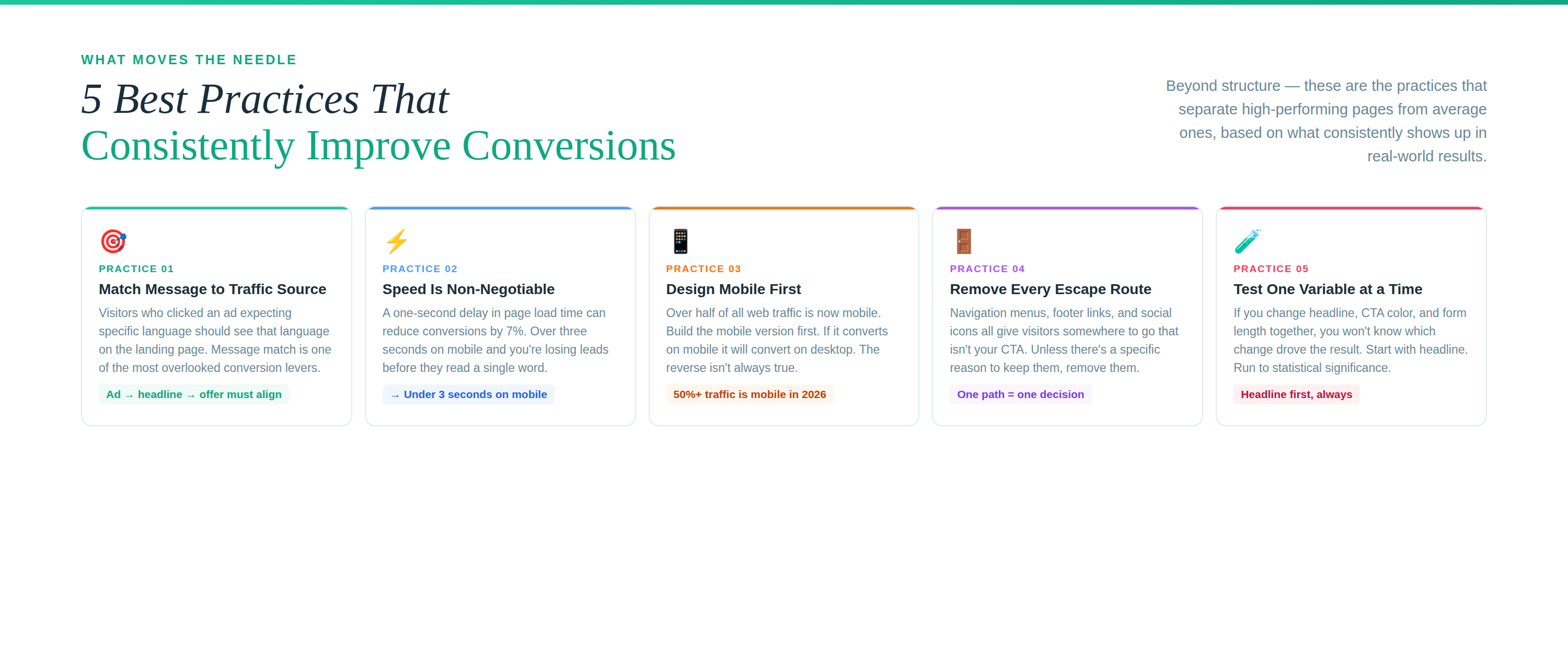
Match the Message to the Traffic Source
A visitor clicking a Google ad for “affordable email marketing for small businesses” should land on a page that uses that exact language. If your ad says one thing and the landing page says something different — even if it’s technically accurate — you break the mental flow and lose the click.
This is called message match. It’s one of the most overlooked conversion levers. When the ad, the headline, and the offer all align, visitors feel like they’re in the right place. That trust translates directly into conversions.
Speed Is Not Optional
A one-second delay in page load time can reduce conversions by 7%. That stat has held up across multiple studies across multiple years. If your landing page takes more than three seconds to load on mobile, you’re losing leads before they read a word.
Optimize images, minimize scripts, and use a reliable hosting platform. If you’re building pages through a dedicated marketing platform, this is often handled for you — one less thing to manage manually.
Design for Mobile First
More than half of all web traffic now comes from mobile devices. Design decisions that look fine on a desktop — long paragraphs, small CTAs, multi-column layouts — can break completely on a phone.
Build the mobile version first. If it converts on mobile, it will convert on desktop. The reverse isn’t always true.
Remove Every Escape Route You Don’t Need
Navigation menus, footer links, and social icons all give visitors somewhere else to go. Unless there’s a specific reason to keep them, remove them from your landing pages. You brought this visitor here for a reason. Make the only logical next step the one you want them to take.
Test One Thing at a Time
A/B testing landing pages is valuable, but only when you test variables in isolation. If you change the headline, the CTA color, and the form length simultaneously, you won’t know which change drove the result.
Start with the highest-impact element — usually the headline. Run the test until you have statistical significance, then move to the next variable. It’s slower than testing everything at once, but the data is actually useful.
Real-World Examples: What This Looks Like in Practice
Theory is useful. Seeing it applied is better. Here are three fictional-but-realistic scenarios that illustrate how these principles play out.
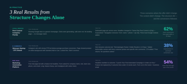
Example 1: Local Service Business — Pest Control Company
A regional pest control company in Florida was running Google Ads to a general homepage. The ads were generating clicks, but very few calls.
The fix was simple: build a dedicated landing page for each service area and campaign. The headline was changed from the company tagline to “Same-Day Pest Control in [City] — Guaranteed or Your Money Back.” Navigation was removed. The form asked only for name, phone, and zip code.
The page added three Google review excerpts with star ratings and a photo of a local technician. One clear CTA: “Schedule My Free Inspection.”
Conversions from paid traffic went up 62% in the first 30 days. The content hadn’t changed. The structure had.
Example 2: E-Commerce Brand — Skincare Startup
A direct-to-consumer skincare brand was running Instagram ads promoting a new moisturizer. The ad creative was performing well — good CTR — but purchase conversion rates were below industry average.
The landing page showed the product against a clean background, a short description, and a standard Add to Cart button. It looked fine. It just didn’t convince.
The revised page led with the outcome: “Dermatologist-Tested Formula. Visible Results in 14 Days.” Below the hero: a short before/after section with three customer photos and specific comments about texture and skin feel. The CTA added a reassurance line: “Free returns. No questions asked.”
Purchase conversion rate improved 38%. The product hadn’t changed. The page now did the work of selling it.
Example 3: B2B SaaS — Marketing Automation Platform
A small B2B software company was offering a free trial of their email marketing platform. Their landing page had a headline about features, a long bullet list of capabilities, and a form asking for company name, role, team size, phone number, and email.
The revised page led with the outcome, not the features: “Launch Your First Automated Email Campaign in Under an Hour.” The feature list was replaced by three outcome-focused lines, each under 12 words. The form was cut to first name and business email only.
Free trial sign-ups increased 54% in the first month. More importantly, trial-to-paid conversion also improved — because the people signing up now had clearer expectations about what the product actually did.
How to Build Landing Pages Without a Developer
You don’t need a web development team to build landing pages that convert. Dedicated marketing platforms have made it possible for anyone to build, launch, and optimize pages without touching a line of code.
The right platform handles:
- Drag-and-drop page building with professionally designed templates
- Mobile-responsive layouts out of the box
- Form integration that connects directly to your email and CRM
- A/B testing without needing a developer to split traffic
- Fast load speeds through optimized hosting infrastructure
Adaptix includes a built-in landing page builder designed to work alongside your email campaigns and automation workflows — so the page, the form, and the follow-up sequence all live in the same system. No stitching tools together. No broken integrations. Just a clean pipeline from click to conversion.
The Conversion Checklist: Before You Publish
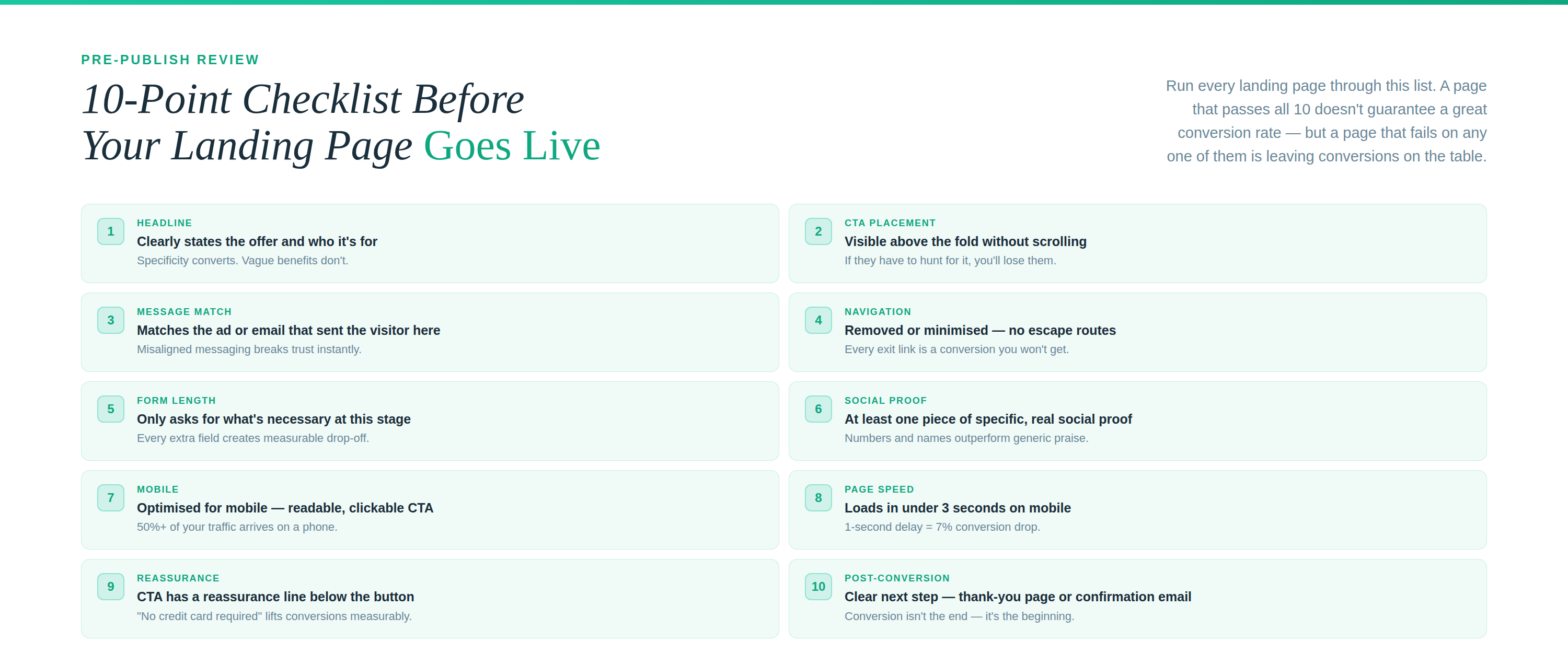
Run every landing page through this list before it goes live:
- Does the headline clearly state the offer and who it’s for?
- Is the CTA above the fold and visible without scrolling?
- Does the page match the messaging of the ad or email that sent the visitor here?
- Is navigation removed or minimized?
- Is the form asking only for what’s necessary?
- Does the page include at least one piece of specific social proof?
- Is the page optimized for mobile?
- Does the page load in under 3 seconds?
- Is there a reassurance line near the CTA (no spam, free cancellation, money-back, etc.)?
- Is there a clear post-conversion experience — a thank-you page, confirmation email, or next step?
The Bottom Line
A landing page that converts isn’t a design exercise — it’s a conversion exercise. The design serves the message. The message serves the offer. The offer serves a specific person with a specific problem.
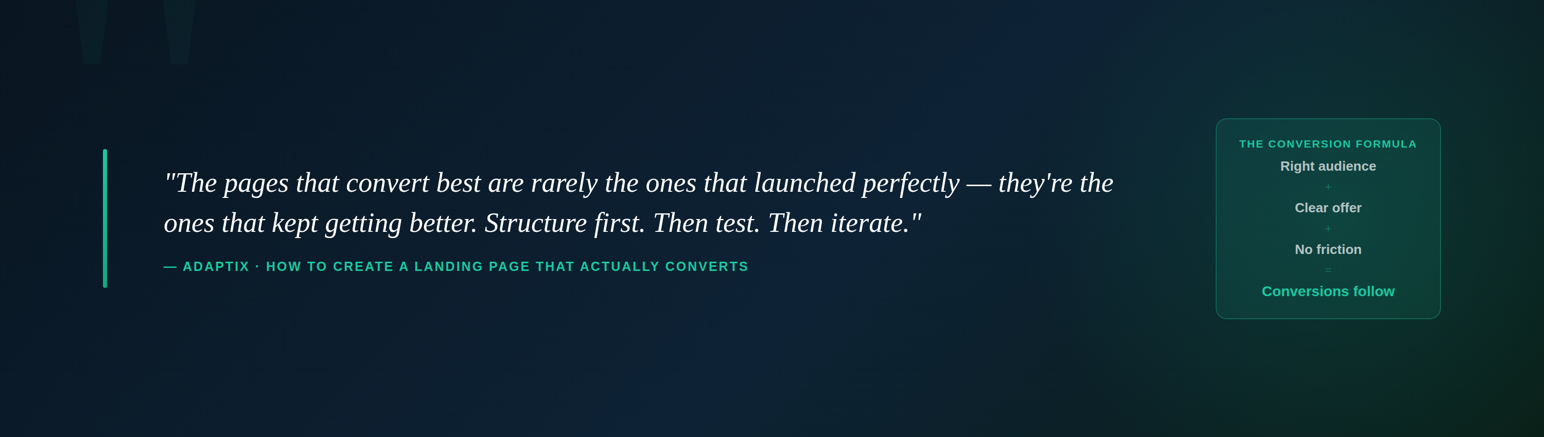
When those three things align — and when the page removes every reason to leave without acting — conversion rates follow. It’s not complicated. It just takes discipline to strip out everything that doesn’t earn its place on the page.
Start with the structure outlined here, test one variable at a time, and iterate on what the data tells you. The pages that convert best are rarely the ones that launched perfectly — they’re the ones that kept getting better.